
Python画图之Seaborn-2
声明:此文大部分样例及参考来源于科赛Kesci的公众号,学习后整理的学习笔记,特此声明。
seaborn官方网站:http://seaborn.pydata.org/examples/index.html ,提供了大量的gallery可直接替换到业务中使用
在做数据分析&挖掘的时候,描述性统计必不可少。比如:我们需要去看看各个quantitative变量的分布情况,良好的分布可视化效果会为之后进一步做数据建模打下基础。这篇文档结合科赛网上面的链家二手房数据集,对如何使用seaborn这个强大的库做distribution visualization做一下讲解。 对于quantitative变量做分布可视化,主要有两点,一是探寻变量自身的分布规律,也就是univariate distributions可视化;二是探寻两个变量之间是否有分布关系,也就是bivariate distributions可视化。seaborn也是按照这个workflow给出了plot function. univariate distributions visualization: distplot — 绘制某单一变量的分布情况 kdeplot — fit某变量(单一变量或两个变量之间)分布的核密度估计(kernel density estimate) rugplot — 在坐标轴上按戳的样式(sticks)依次绘制数据点序列 bivariate distributions visualization: jointplot — 绘制某两个变量之间的分布关系
ls ../input/shhouse/
cd ../input/shhouse/# 读取数据
import pandas as pd
sh = pd.read_csv('sh.csv',encoding='gbk')# 查看数据
sh.head()# 为了避免中文在绘图的时候无法输出,对column的名称进行修改
sh = sh.rename(columns = {"小区名称":'xiaoqu','户型':'huxing','面积':'Area',
                          '区域':'Dist','楼层':'Floor','朝向':'Face','价格(W)':'Tprice',
                          '单价(平方米)':'Price','建筑时间':'Time'})
# 对区域按照对应的汉语拼音重新编码
sh.Dist = sh.Dist.map({'浦东':'Pudong', '闵行':'Minhang', '宝山':'Baoshan',
             '徐汇':'Xuhui', '普陀':'Putuo', '杨浦':'Yangpu', '长宁':'Changning',
              '松江':'Songjiang', '嘉定':'Jiading', '黄浦':'Huangpu',
              '静安':"Jing'an",'闸北':'Zhabei', '虹口':'Hongkou', '奉贤':'Fengxian',
               '青浦':'Qingpu', '金山':'Jinshan', '崇明':'Chongming'})

#这一步实际上没必要,python的绘图模块完全可以处理# 导入绘图的包
import warnings
warnings.filterwarnings("ignore")
import seaborn as sns
import matplotlib.pyplot as plt
%matplotlib inline
单一变量可视化初探
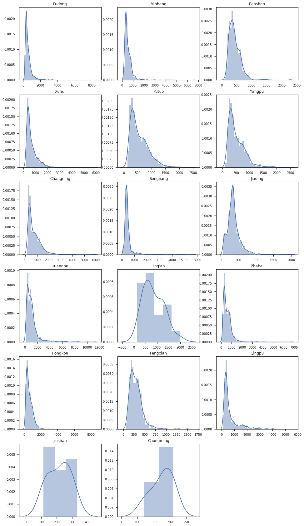
在这个数据集中,quantitative的变量主要有房屋的面积Area,每平米单价Price,以及房屋总价Tprice. 先来看看上海每个行政区房屋总价的分布情况,我们用distplot绘制。需要注意的是,在默认情况下,distplot会直接给出变量核密度估计的fit曲线。
dist = sh.Dist.unique()

plt.figure(1,figsize=(16,30))
with sns.axes_style("ticks"):
    for i in range(17):
        temp = sh[sh.Dist == dist[i]]
        plt.subplot(6,3,i+1)
        plt.title(dist[i])
        sns.distplot(temp.Tprice)
        plt.xlabel(' ')

plt.show()
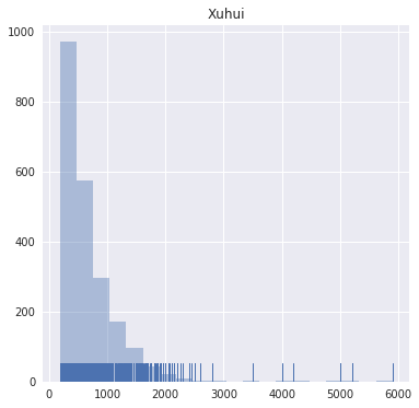
当然,我们也可以关闭核密度估计fit曲线,直接去看直方图分布(histograms)。seaborn在distplot function的API中给出了kde和rug这两个参数,分别对应kernel density和rugplot(也就是在坐标轴上绘制出datapoint所在的位置)。 我们单独取出徐汇区(Xuhui)的数据,对kde和rug这两个参数进行设置,做出的直方图如下。
temp = sh[sh.Dist == 'Xuhui']
plt.figure(1,figsize=(6,6))
plt.title('Xuhui')
sns.distplot(temp.Tprice,kde=False,bins=20,rug=True)
plt.xlabel(' ')
plt.show()
在seaborn中,我们也可以直接调用kdeplot和rugplot去做图。 现在我们去研究一下徐汇区数据中,房屋面积的分布情况。
from scipy import stats, integrate
plt.figure(1,figsize=(12,6))

with sns.axes_style("ticks"):
    plt.subplot(1,2,1)
    sns.kdeplot(temp.Area,shade=True)
    sns.rugplot(temp.Area)
    plt.title('Xuhui --- Area Distribution')

plt.subplot(1,2,2)
plt.title('Xuhui - Area Distribution fits with gamma distribution')
sns.distplot(temp.Area, kde=False, fit=stats.gamma)

plt.show()
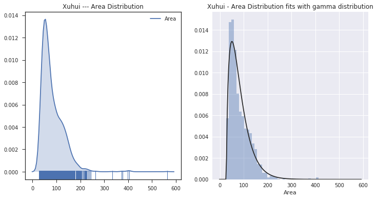
上方左图是kdeplot function和rugplot function分别调用后的叠加,体现了seaborn做图的灵活性。右侧则是利用在distplot function设置了fit参数,让数据的分布与gamma分布进行拟合。
两个变量(pairs)可视化
在做了单个quantitative变量分布的可视化研究后,我们来看看某两个变量组之间是否存在分布关系。seaborn在这里提供了jointplot function使用。 下面我们来对整个数据集的房屋面积(Area)和房价(Tprice)这两个变量进行可视化分析。
sns.jointplot(x='Area',y='Tprice',data=sh)
plt.show()
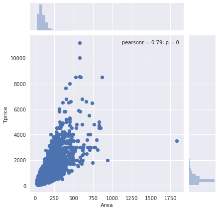
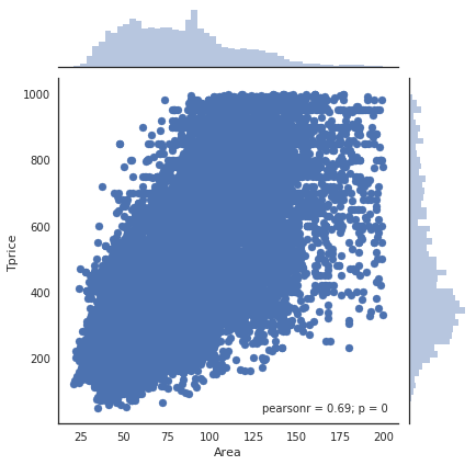
我们发现房价小于1000W并且面积小于200平方米的数据点很集中。设置一个filter,将这部分数据单独拿出来做研究,重新绘制散点图。
test = sh[(sh.Tprice<1000)&(sh.Area<200)]
with sns.axes_style("white"):
    sns.jointplot(x='Area',y='Tprice',data=test)
plt.show()
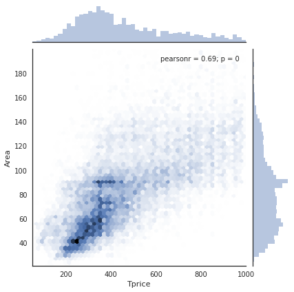
当数据量很大的时候,可以利用hexbin plot去做可视化,显示数据集中分布的区域,如下图所示。
with sns.axes_style("white"):
    sns.jointplot(x='Tprice',y='Area',data=test,kind='hex')
plt.show()
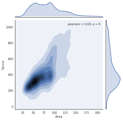
当然,我们也可以用kernel density estimation去做可视化,看分布情况。如下图所示
with sns.axes_style("white"):
    sns.jointplot(x='Area',y='Tprice',data=test,kind='kde')
plt.show()
小结
seaborn的巧妙之处就是利用最短的代码去可视化尽可能多的内容,而且API十分灵活,只有你想不到的,没有你做不到的。 API reference:distplot, kdeplot rugplot.再次声明学习资源来源于科赛网的整理